Visual Identity
Environmental
Digital Art
Product
Editorial
Promotional
User Interface
Brief
It is a new company that brings together the experience and expertise of several university professionals in the fields of law, social sciences and notary; pioneers in providing, exclusively, legal advice and defense in lease and eviction matters throughout Uruguay.
«Moodboard»


Objective
Achieve a formal appearance that conveys credibility, stability and rigidity through the appropriate use of a serif font (formal, serious, authoritative and firm-based, as opposed to grotesque fonts) as the protagonist accompanied by a neutral (impartial) gray-based color palette and an isotype that represents these characteristics in its own right.
««Logo»»

Typographic font
The capstones (also called “terminals”) denote a stable structure; a foundation upon which it has been built upward.
The connotation behind this is the foundations of the study: the knowledge of law that has given rise to individual and group growth as an enterprise; the foundations upon which it will be exercised in pursuit of a just becoming for its defendants.
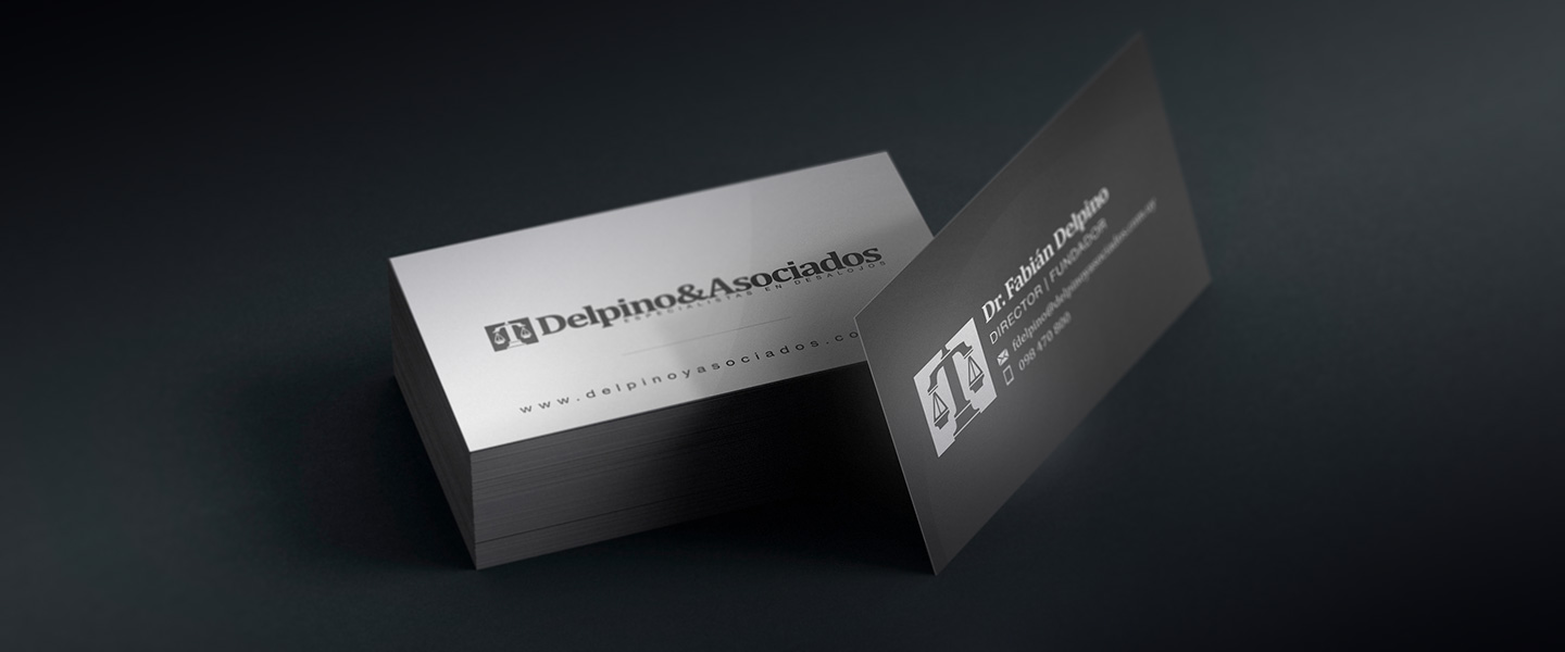
Functionally, it is a font of good legibility, without too much contrast in thickness between the flagpoles and arms.
The box height is relatively high compared to other serif fonts, allowing a lower ratio between length and height, which facilitates the usability of the logo.
Conceptually, due to the subtly ordinary look represented by the set of spurs, serifs and apexes built under the same criteria as the rest of the elements; it is a neutral or impartial personality (key concept when it comes to fairness).
Finally, the angular endings (not rounded), including the apex of the “i”, convey the rigidity and seriousness that was sought as an objective.


Unity
While the scale as a symbol of advocacy is a cliché, it is so standardized that it is not worth sacrificing the instant assimilation of ideas for originality. The challenge was, then, to generate distinction through its form.
It was built based on the characteristics of the typeface, forming a unit, as if it were part of the font family. This facilitates the association between the isologue and the logotype, the appeal and the distinction from its peers.
Visual Identity
Imagotype
Visual Identity
Isotype
Visual Identity
alternative Imagotype
Imagotype, Isotype and alternative version
Monocolor
White
Monocolor
Black
Monocolor versions


Back to Portfolio
«« Business Card »»


Front and back


««Website»»

Website's preview
Ergonomic design
Each website has its specific functions that may vary from case to case, but the efficiency with which they are achieved will depend on several criteria within cognitive ergonomics.
Intuitive and coherent navigation is key to the success of any interactive multimedia system, as well as being able to offer different types of potential users the necessary tools to reach certain urgent information or to calmly browse the site in search of credibility and trust.


Pages and sections

Responsive design
Although surfing the Internet from a cell phone is not ideal, a large number of Internet users use the device as a first resource -more out of anxiety than necessity, unfortunately-. And, depending on the field in question, in many cases they are the majority.
For them and for those who, on occasions, must resort to using them as an alternative, today it is mandatory to design thinking about the user experience from each of the different devices and sizes available.
««Social Networks»»

Presence in social media

