Visual Identity
Environmental
Digital Art
Product
Editorial
Promotional
User Interface
Brief
As an internal unit of the local Republic’s University (Uruguay), the institution lacked a recognizable identity and a platform of its own, making it difficult for it to be exposed.
From there arose the need to develop the Institutional Visual Identity in order to transmit and promote both its raison d’être and its publications, in a centralized way and with the imprint that it deserves.
«Moodboard»



Objective
To develop an aesthetic guideline that, in addition to confidence and professional credibility, would also convey a strong sense of containment in communion.
It was crucial to work with a friendly color palette that suggested tranquility and a composition of blocks organized in a grid easily associated with familiar and symmetrical geometric shapes, as far away as possible from any chaotic interpretation.
««Logo»»

Community
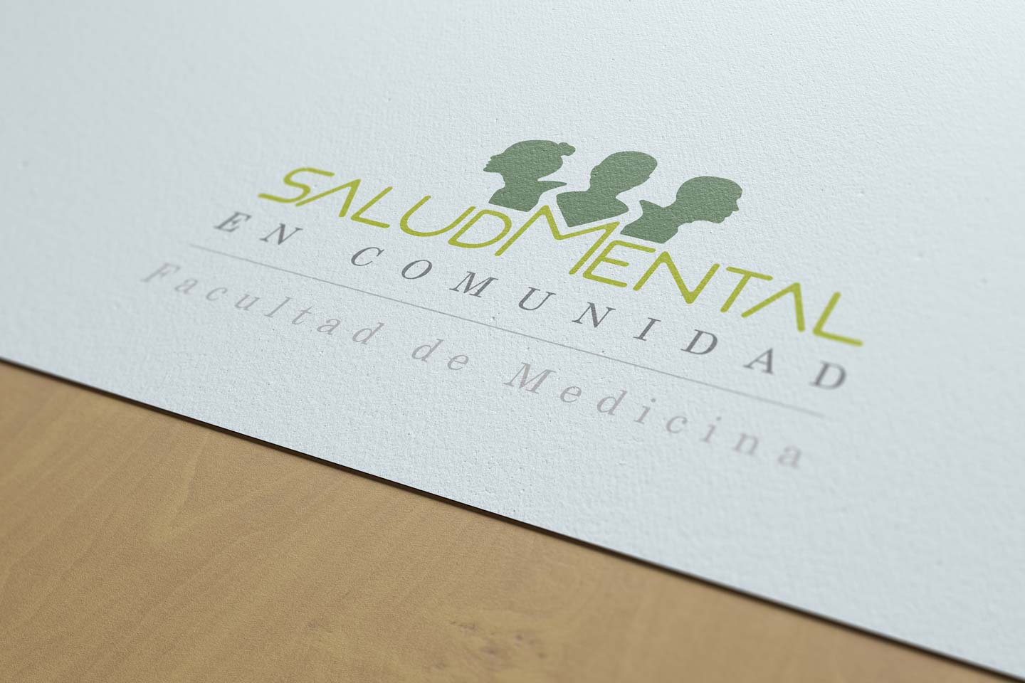
The shapes here are intended to denote the silhouette of three people united in an embrace of containment. Because the emphasis is on mental health, the graphic representation focuses on the heads.
Their shapes suggest the presence of two adults (representing guardianship) and a child; in turn, comprising all genders.
They are the objective of the institution, that is why they are above the name; they arise from the concepts of welfare and union (communion) and that is precisely what the shape connotes.
Typographic fonts
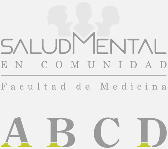
The main purpose of the font created for the name is to convey a sense of harmony through the evident axial symmetry of the construction grid on which the characters are arranged. While the vertices, with a rounded union -avoiding the presence of angles- softens the interpretation of the shape, providing fluidity and avoiding the visual violence of the angular edge.
But it also seeks to convey seriousness, credibility and sustainability.
sustainability. To this end, the lower blocks of text are taken, in a style characterized by the serif that invites to follow the horizontal support line (the line), strengthening the idea of a solid and reliable base: the foundations of study and knowledge, thanks to which mental health in community is possible.
Color palette
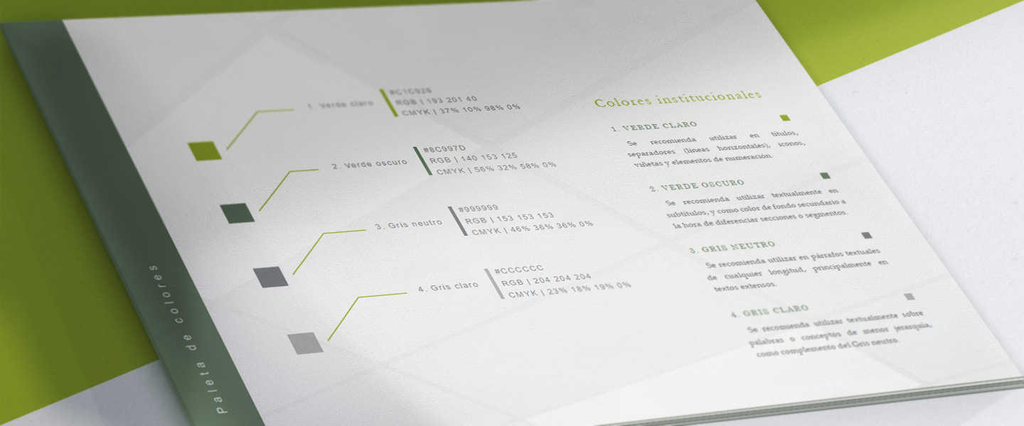
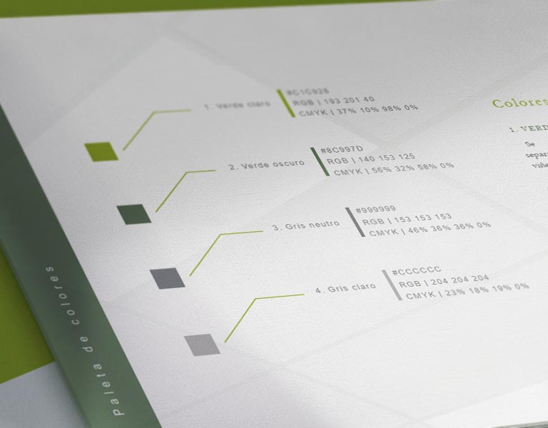
The color green and its different tonal values
tonal values are associated with well-being and health.
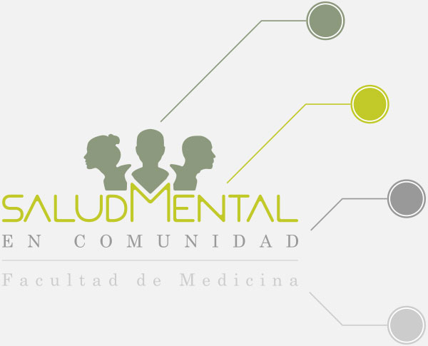
The name, formed by the thin lines of the typographic font, as opposed to the first block
typographic font, as opposed to the first block (of filled silhouettes and vast area), allows us to use a more saturated and striking color without being overwhelming.
It was highlighted by moving the green tone closer to yellow, bringing warmth and vitality to the overall sense of well-being.
The lower block oscillates between different gray values, reinforcing the sense of seriousness and credibility that it brings from its shape and position as the foundations of knowledge.
Visual Identity
Isologotype
Isologotype - preferred version
Monocolor
White
Monocolor
Black
Monocolor versions
Back to Portfolio
««Brand Guidelines»»
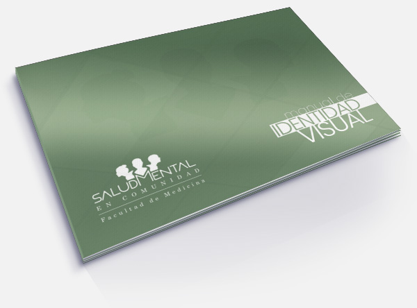
Visual Identity Manual
With the objective of generating a consistent, recognizable and appealing identity, the Visual Identity Manual gathers criteria and rules of use applied to the logo, institutional fonts and color palette.
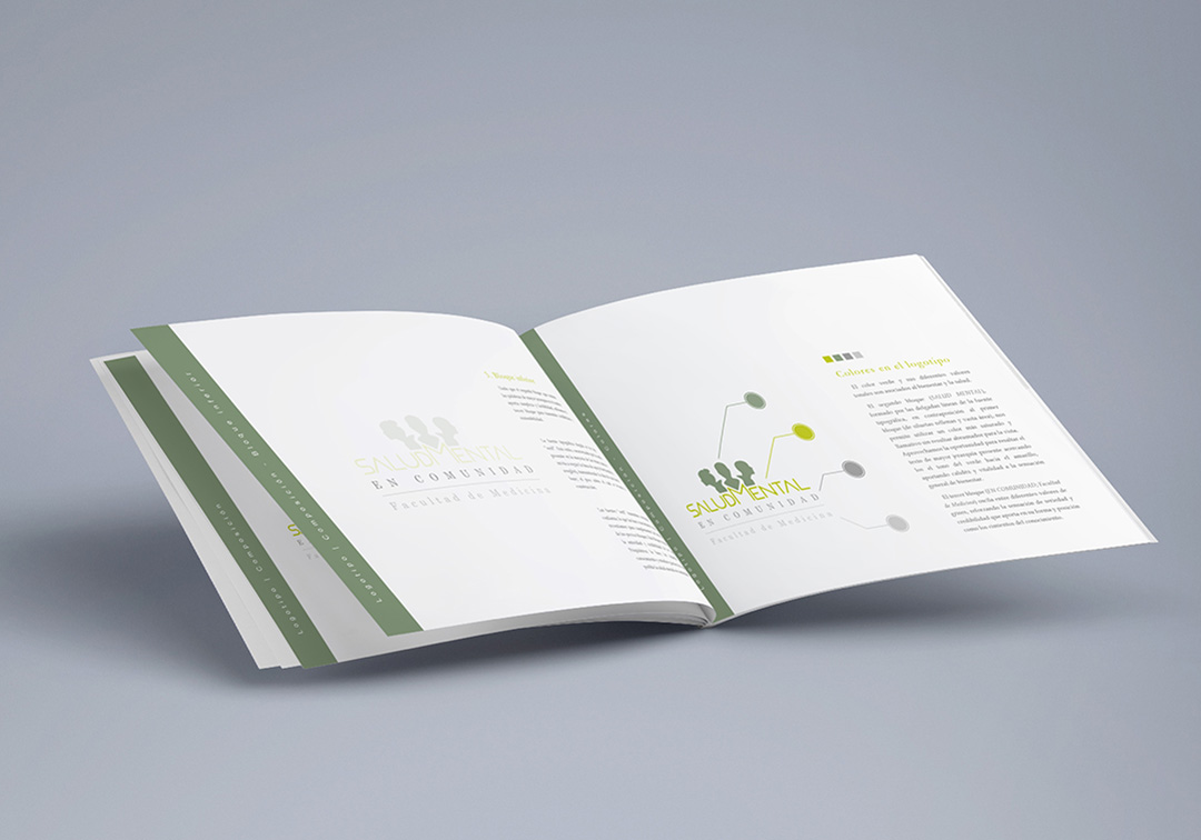
Margins
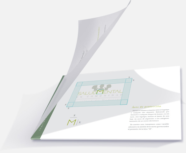
Part of the manual’s content consists of specifying the protection area or margins of the logo, minimum distance to be respected between the logo and any other element -shape or text block-.
In this case, the variable taken as a reference was the measurement of the edges of the square delimiting the letter “M”.
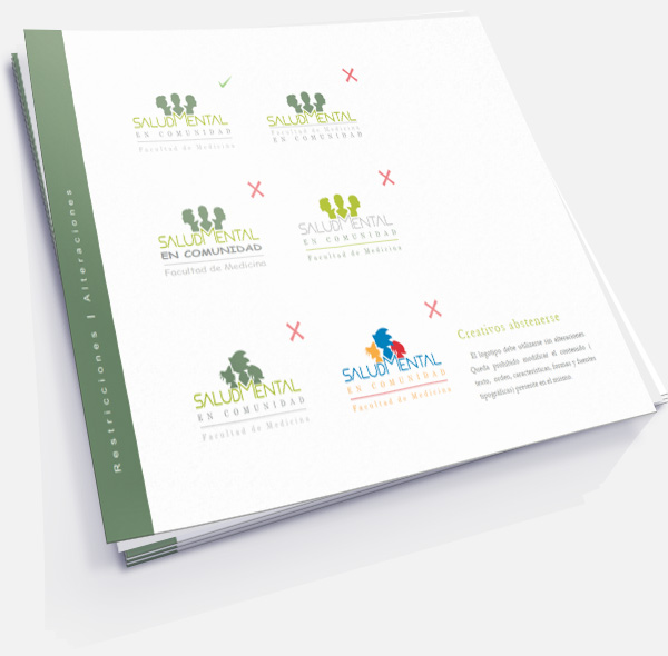
Restrictions
It may seem obvious, but not all people are aware of how important it is to respect the logo as delivered by the designer, with its respective alternative versions and indications of when they should be used.
