Visual Identity
Environmental
Digital Art
Product
Editorial
Promotional
User Interface
Brief
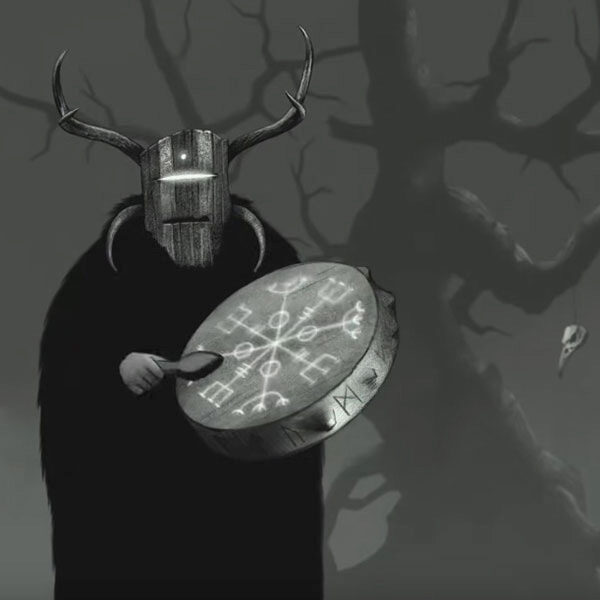
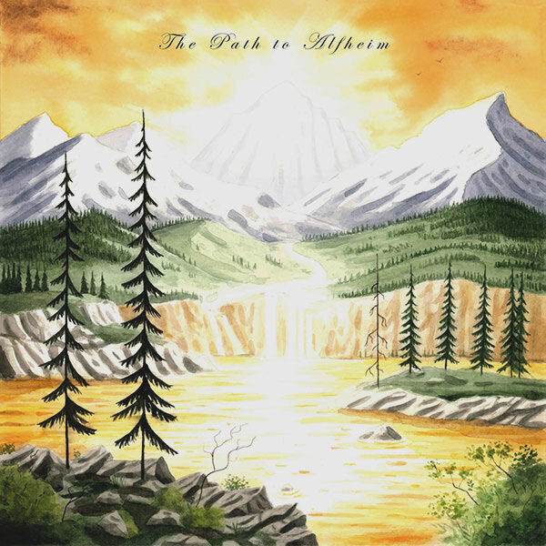
Munknörr is a music project of Shamanic, Nordic and Celtic music with a dark and mystic vibe. They needed an animation to accompany their upcoming EP Album: The Path to Alfheim, a journey through a genre they felt like exploring: epic fantasy.
The band was already stablished by the time Simbionte was reached, nevertheless there were a couple of Visual Identity aspects that could be improved related to their use of imagery across the different media.
«Moodboard»
Objective
Munknörr would benefit of branding guidelines to maintain unity across the diferent media and increase their recognition capabilities even more through consitency. A clear and solid identity to showcase on all social media and streaming platforms customizable profiles, watermarks, intros and outros of their videos.
As for the album’s animation, we decided to stick to it’s cover’s style and create all needed artwork as watercolors exhibited as a two-dimensioned parallax journey that would end exactly there: at the album’s original artwork cover.
««Logo»»
Starting point
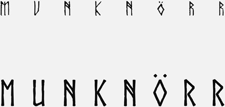
The band used different font types through it’s years. We picked the one that best suited the brand while also being the more legible and practical for reduced size instances and possible future applications like cutting vinyl or 3D printing.
Maintaining recognition
Munknörr has already built a presence online and a community of followers, so the best thing to do in this case was to work with the most characteristic elements that sticked with the band for the most time.
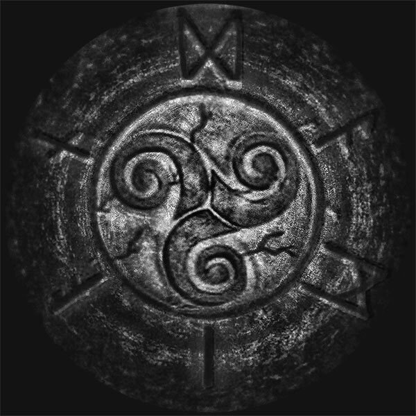
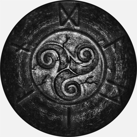
One of those items is this image of a celtic triskel surrounded by runes, carved in stone.
Integration
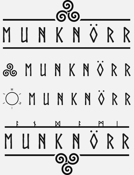
After vectorizing and refining both, triskel and runes, with cracks to match the font and testing different sizes, proportions and line thickness, it was time to make a choice between the different ways of integrating the forms with the typographic logotype.
Visual Identity
Isologotype
Visual Identity
Isotype
Isologotype and Isotype
Monocolor
White
Monocolor
Black
Monocolor versions
Back to Portfolio
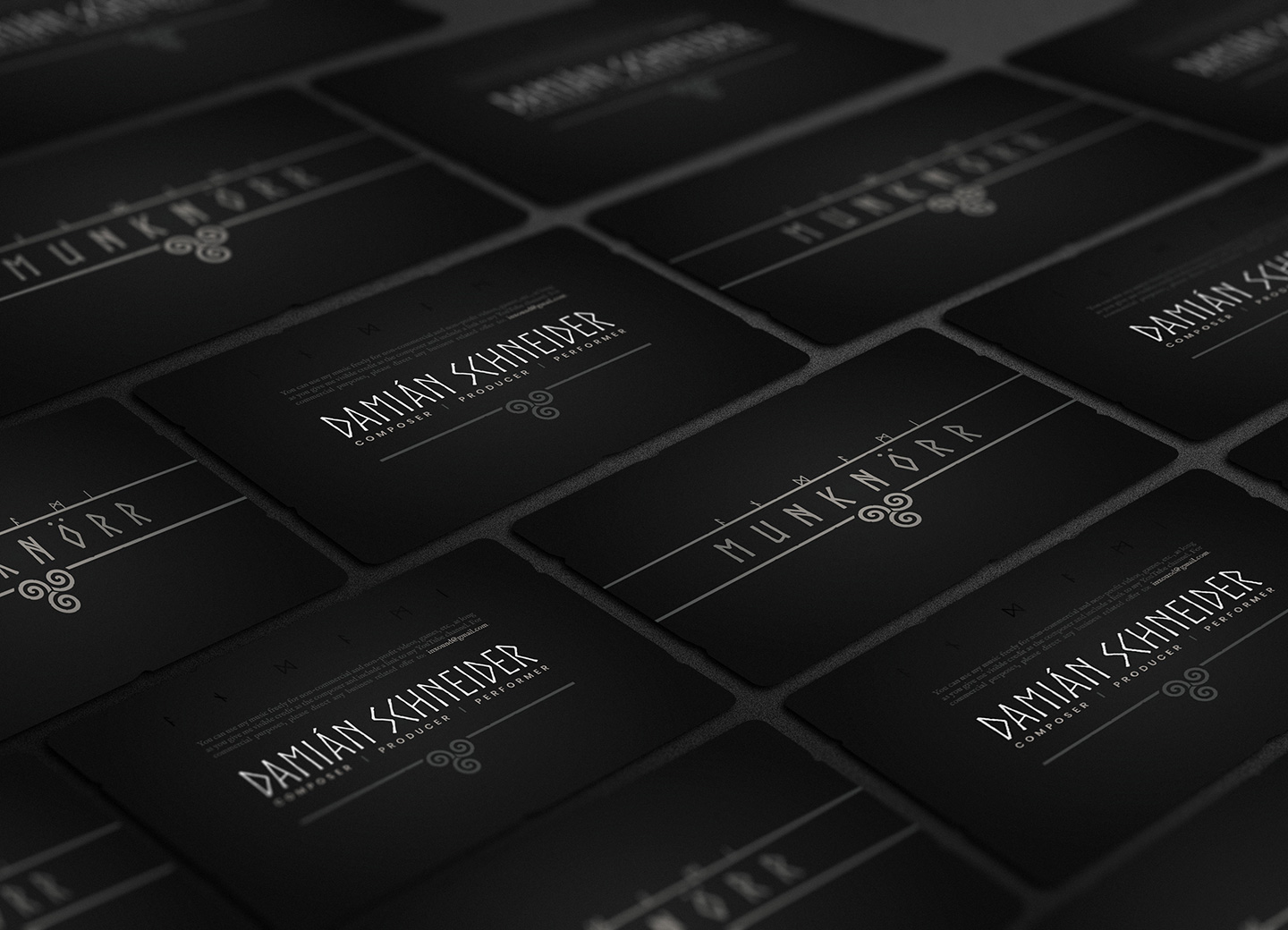
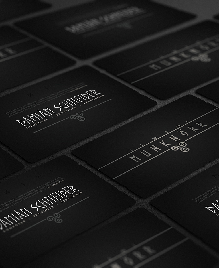
«« Business Card »»



Front and back
««Brand Guidelines»»
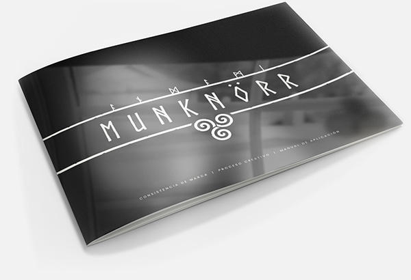
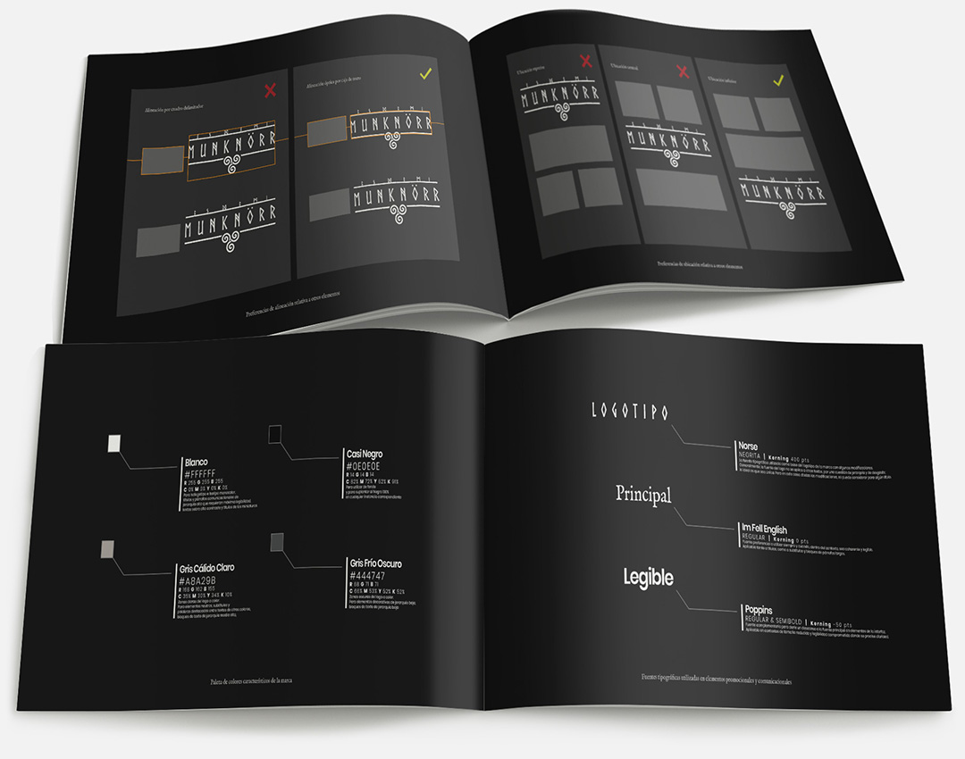
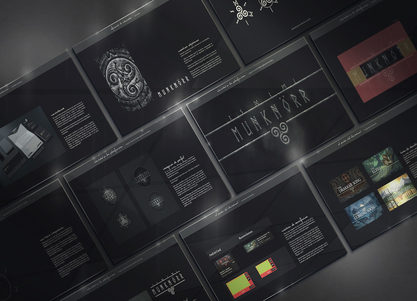
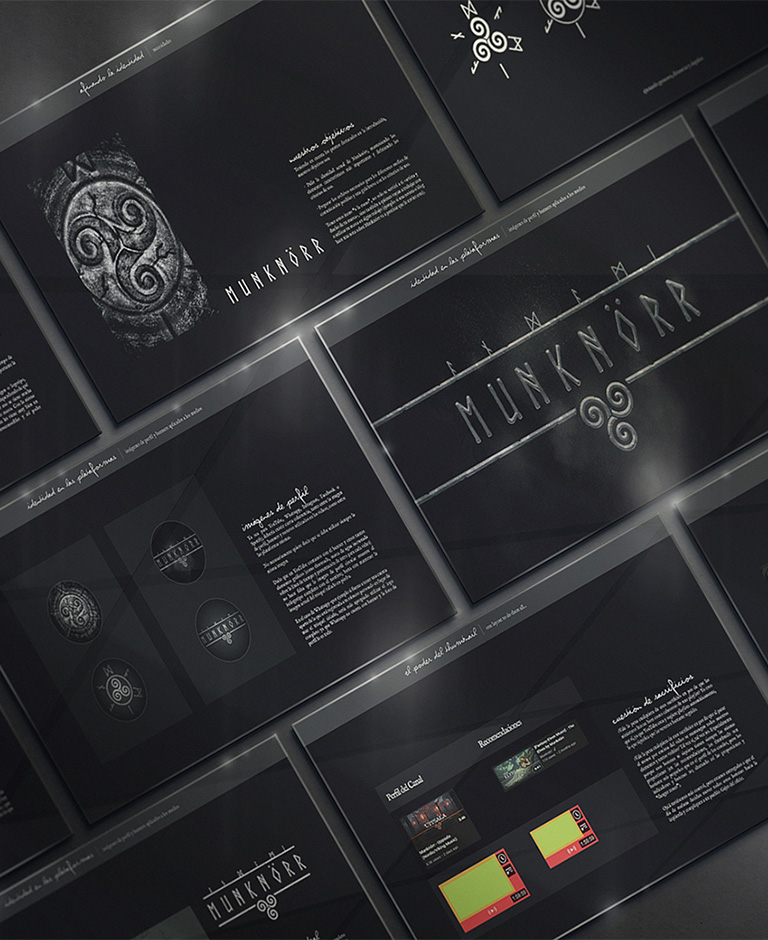
Visual Identity Manual
With the objective of generating a consistent, recognizable and appealing identity, the Visual Identity Manual gathers criteria and rules of use applied to the logo, institutional fonts and color palette.
««Digital Painting»»
The opening scene
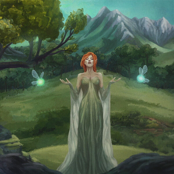
As a whole
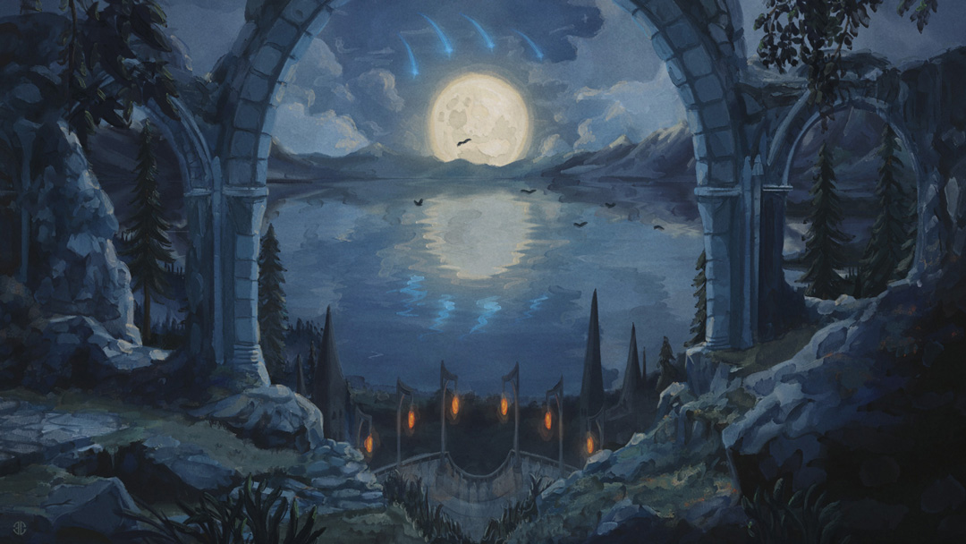
A lot of painting was done to fill more than fifteen minutes of landscape scenery, intercalating characters and other prominent visual elements as special scenes or points of interest for the entire video to be more entertaining and because the music demanded so.
Timing was crucial. It was imperative for each musical breaking point to be reflected visually as well, depicting as a whole the emotive tones in real time. For many stanzas, it also felt appropiate to match it’s keys.
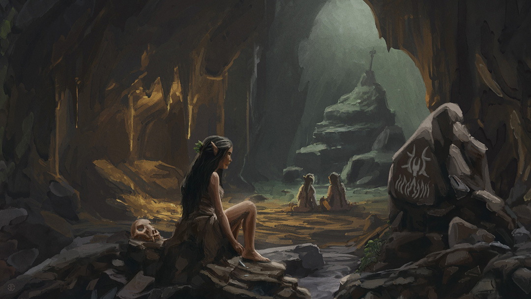
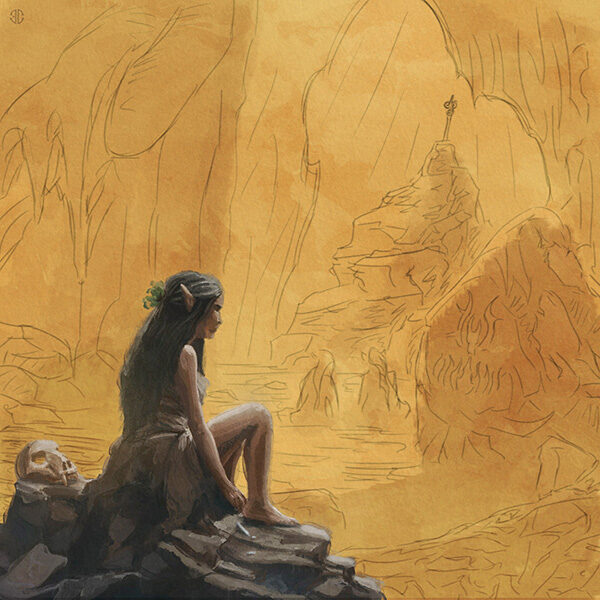
The girl
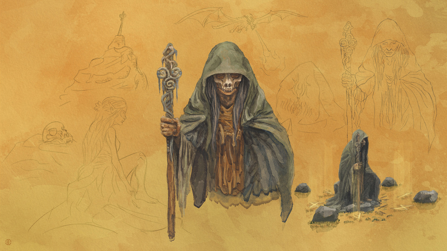
Storytelling
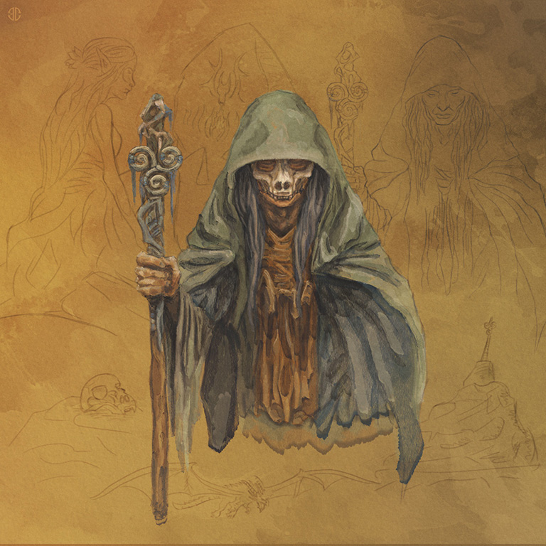
A figure of an old shaman wearing the previously shown skull and staff, appears right after the most chaotic scene where the hateful dragon (reference to the nordic mythologic creature Nidhogg) rains fire upon the earth. Ashes and ruin cover the entire frame until this character slams his staff onto the ground after entering a deep state of meditation, apparently ending with the chaos.
Yet, a melody as nostalgic as sad, conveys the peace is back, but… at what cost? Prophecy of an imminent future or perhaps mere memories of a distant past? Presages of a little prophet that couldn’t save but her own self.
Volver al Portfolio
««Animation»»
The music video
The reason behind the video was to accompany the melodies with a pleasant animation. Originally, the request was about a simple painting of a forest subtly animated in a loop, but when the inspiring muse is as good as Munknörr’s music, creativity will bloom and ideas will flourish to challenge our boundaries.
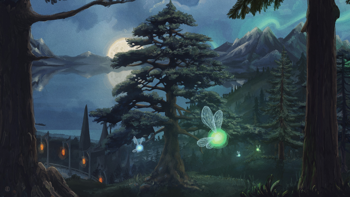
So the task quickly evolved into creating compelling journey through the fantasy world awakened by their music, specifically by the three songs of the EP album and the feelings evoked by them. Scenes had to be painted by sounds; their motion dictated by rhythm; a synchronous piece of art.
The beginning (and the end)
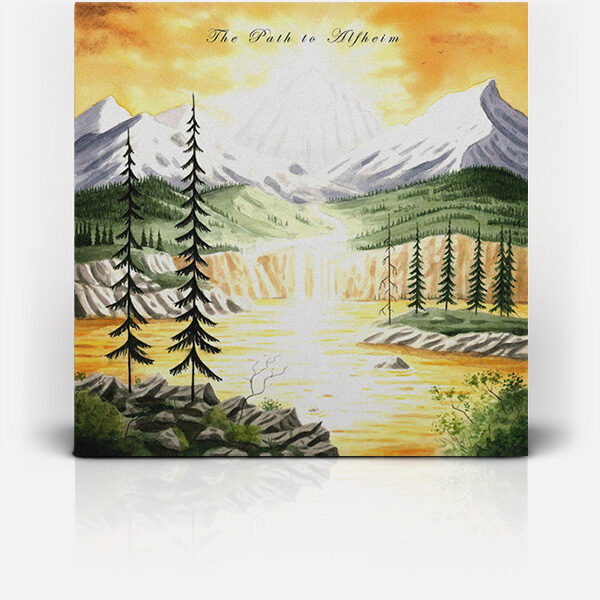
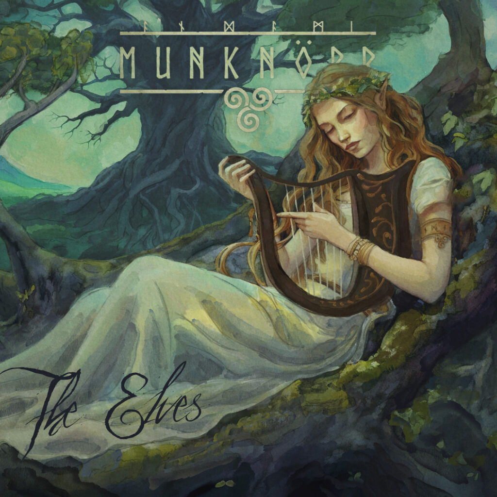
The artwork for the album’s cover was previously done, painted by the amazing traditional watercolors artist Joan Llopis.
So, a very good –and challenging- idea was to digitally paint a whole diversified landscape in a similar artistic style so that the journey through all album’s three songs, from left to right, seamlessly ended up transitioning into Joan’s painting. Somehow, his art was the beginning of our adventure, and the end of the viewer’s.
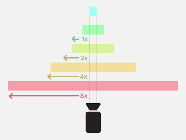
The layers displayed apart and assembled
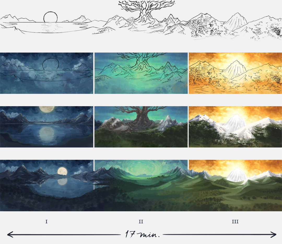
First mood sketches for each song
The structure
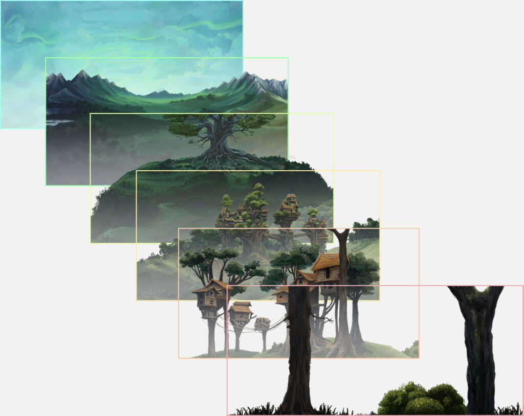
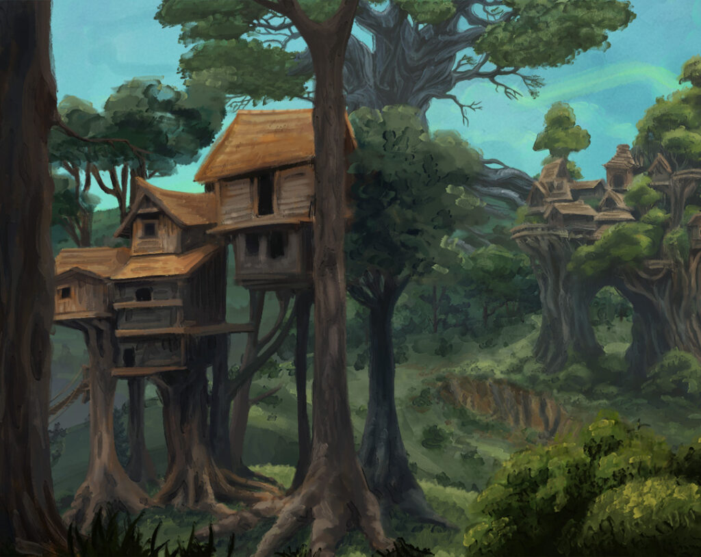
There are six layers of painted landscape overlapped, sliding to the left at different speeds to generate a credible sense of depth and movement. The one at the front is the fastest and biggest image with over 90000 pixels wide.
All layers were necessary to find the sweet spot between “a slow-paced animation to leave playing at the background” and “a compelling journey to watch”. So that the video could be good company to people meditating or playing RPG games without major distractions, while also proving enough variety to entertain those willing to pay full attention.
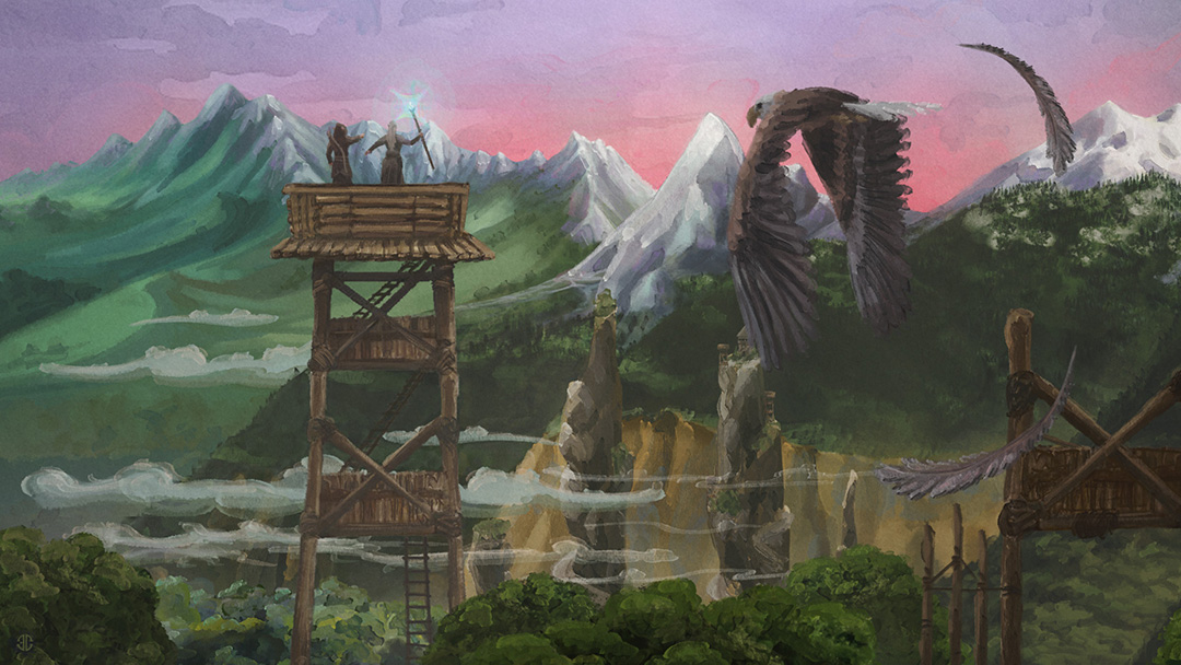
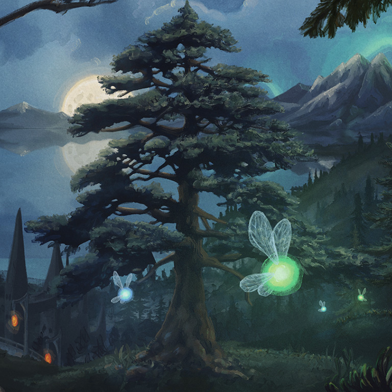
The watchtowers - recreated scenery of the third song
The full music video
Volver al Portfolio
««Music Album»»
Album cover
A scenery foretold
While the music video for the album was being developed, Munknörr released a single album conformed by one it’s songs: The Elves.
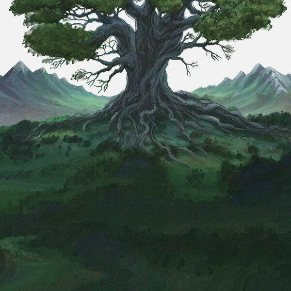
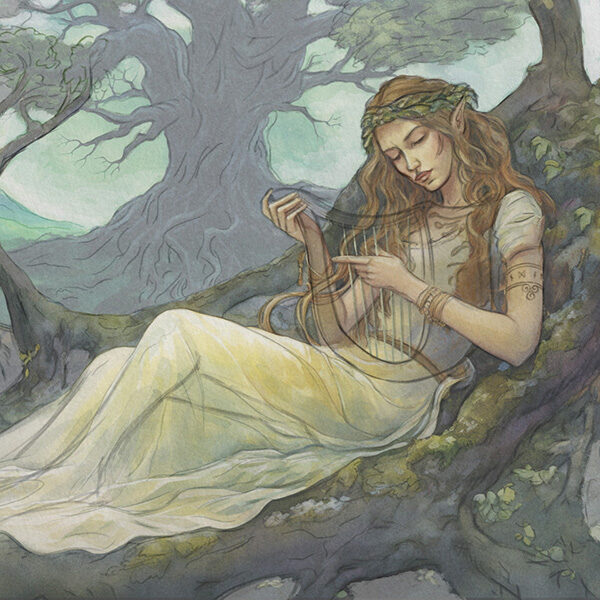
We used visual elements from the animation that were meant to appear in a scene during the same song and refined them to make a good looking composition for this cover stylized in the same way. Then we brought them back, animated and arranged them in the timeline so that we could have glimpse of a similar frame in the video.
The elvish lyrist
The gigantic tree in the back is there to represent Yggdrasil, the sacred tree from Norse Mythology, which connects all nine worlds including Alfheim: home of The Light Elves, kind and beautiful creatures in harmony with nature.
The lyre is the leading instrument of the song’s main melody. It was clear that a peaceful elvish lyrist playing with delightful passion would be perfect for the single album cover’s depiction.
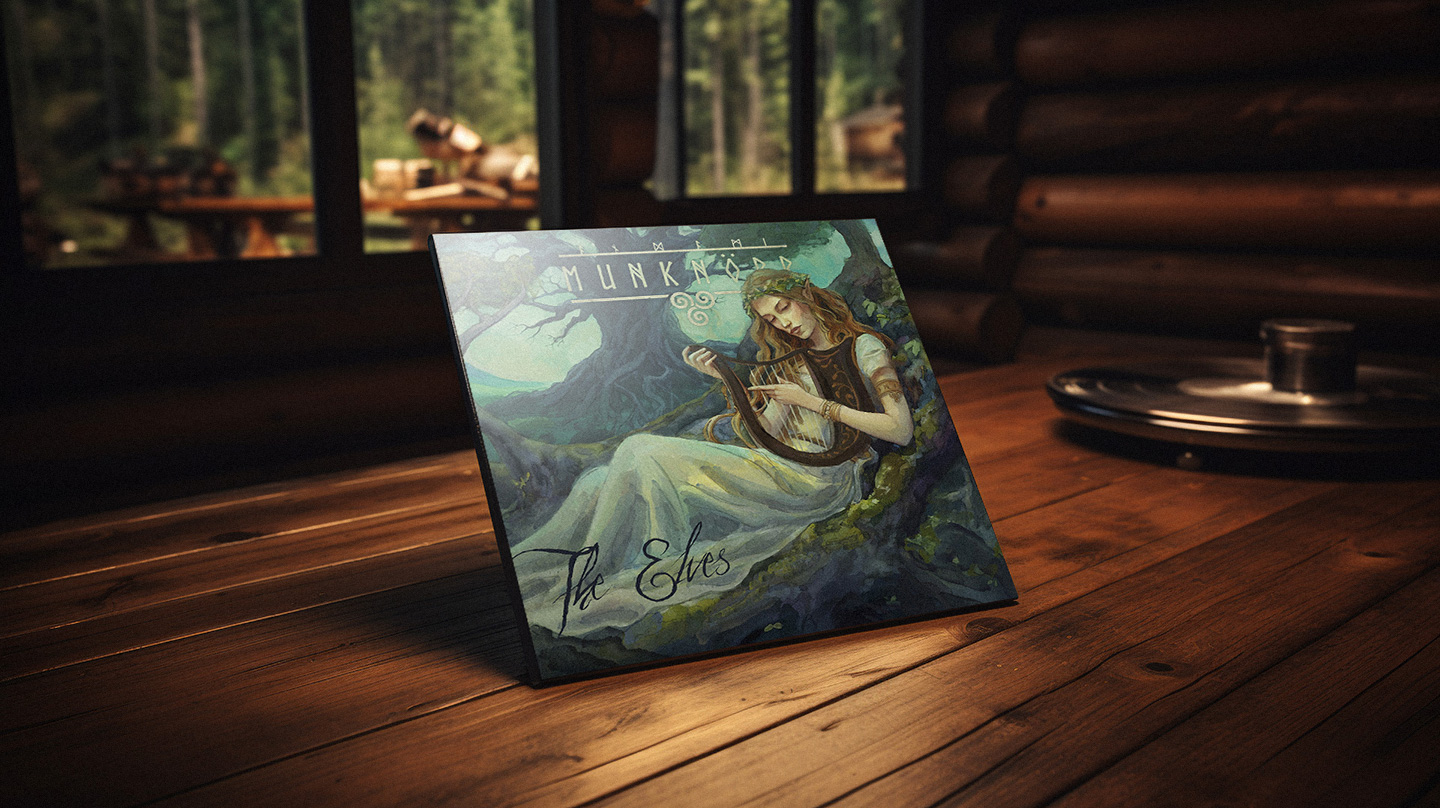
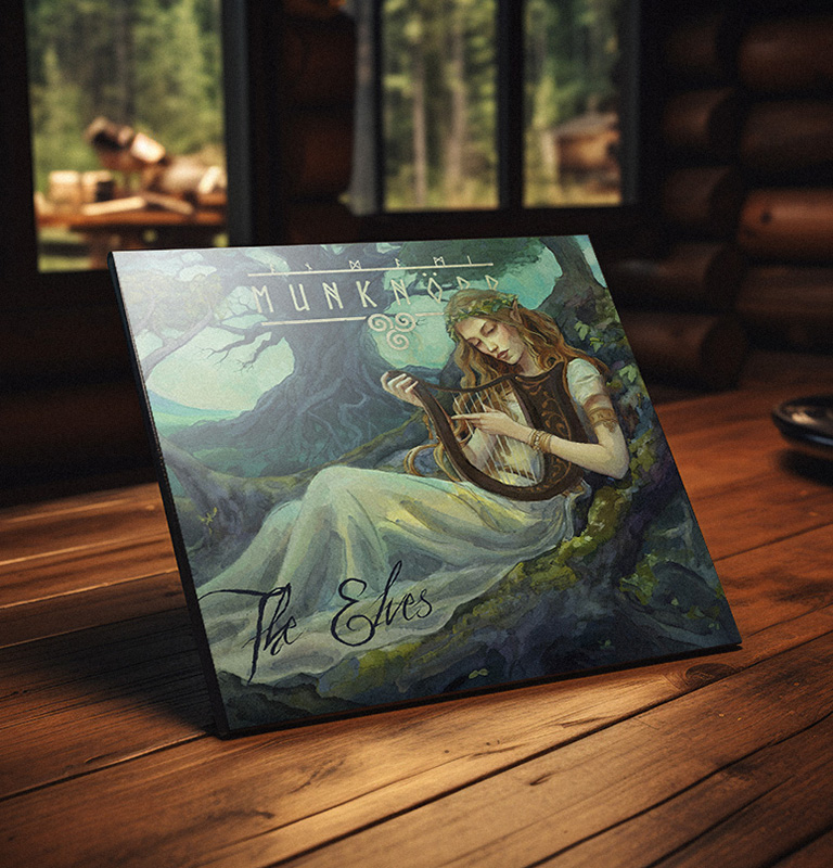
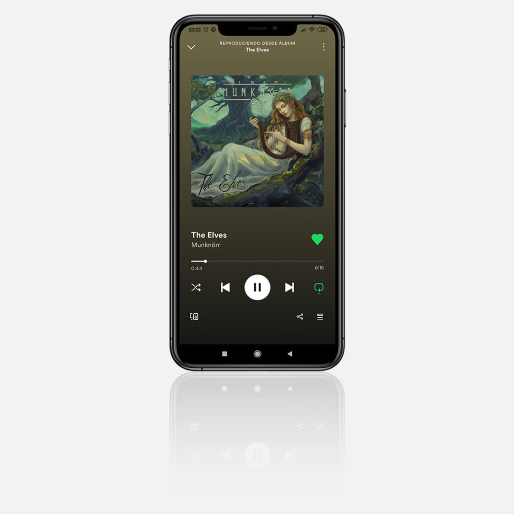
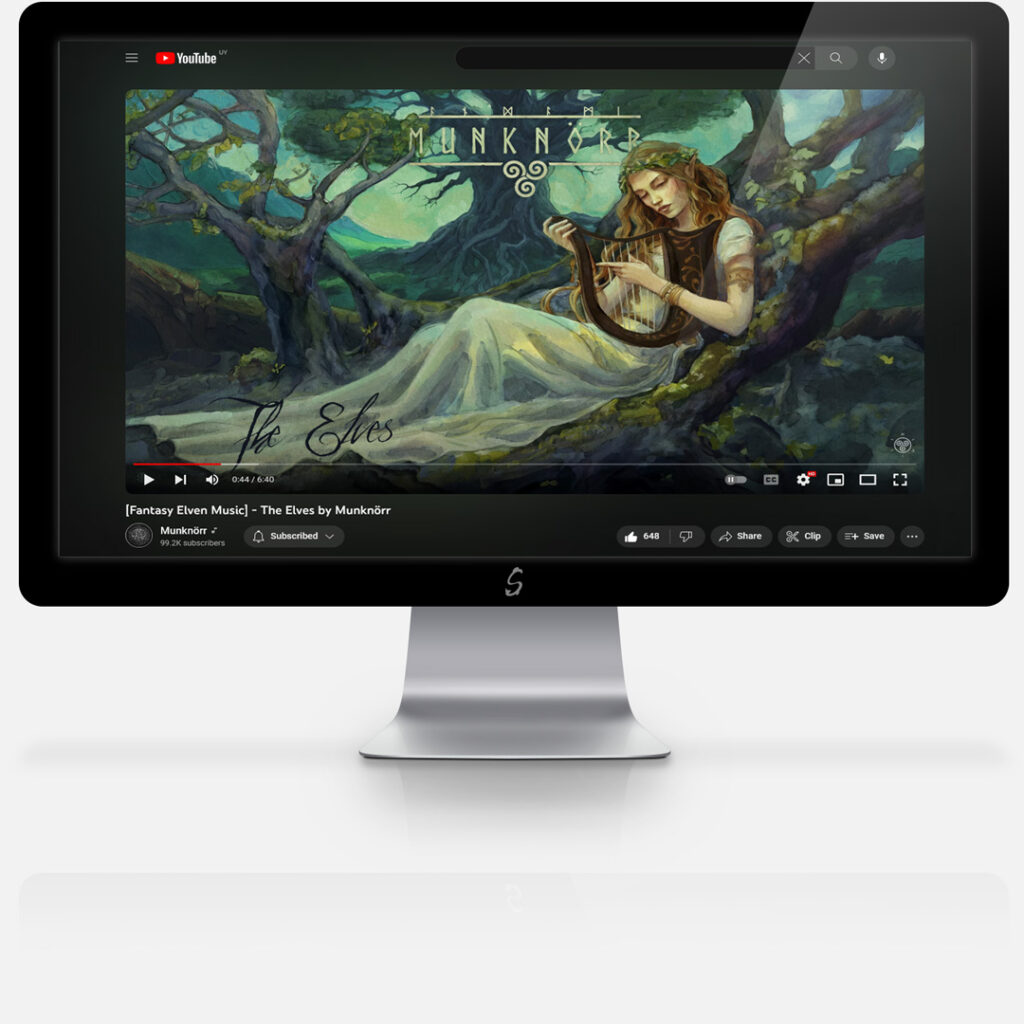
Spotify display and extended artwork adapted for YouTube
««Social Networks»»
Streaming Platforms
Nowadays, streaming platforms are usually the best bet for musicians since compact discs and other physical forms of music products have decreased their demand. This kind of platforms include YouTube, Spotify and online music stores like Bandcamp to support independent artists; all of which allow for a certain level of customized branding to solidify the band’s identity through consistency.
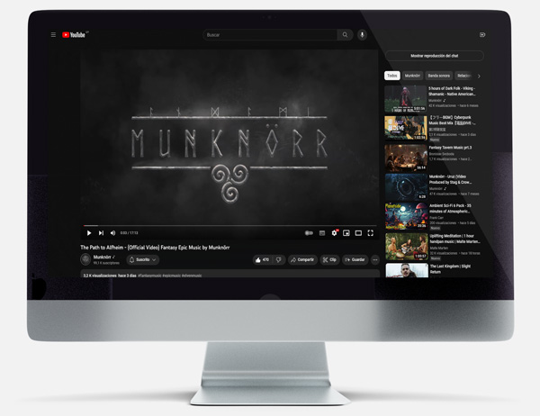
YouTube's Interface
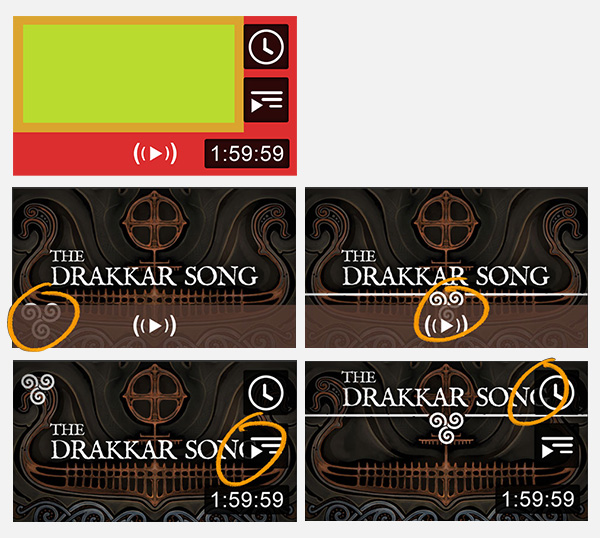
Video Thumbnails
The recommended video’s thumbnails play an important role in the platform. Not only they should be aesthetically appealing, but also help recognizing the brand at a glimpse.
As simple as it seems, it actually presents a challenge due to YouTube’s native interface design elements that cover the thumbnail image and should not be taken lightly. Some of them appear only while mouse-hovering the video, while others block the view permanently; the “safe-zone” is considerably smaller than the total area.
Profile Banner
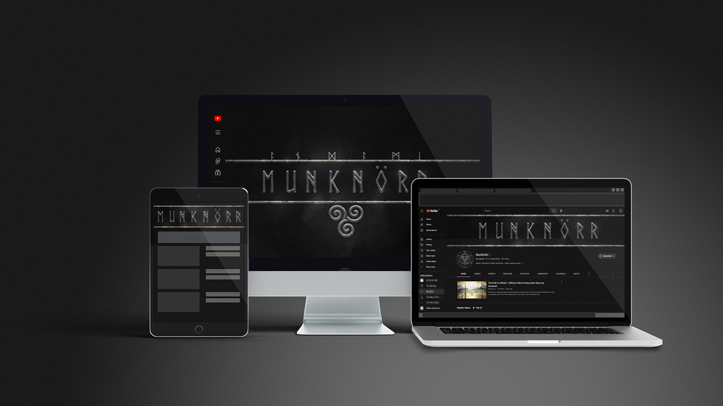
Something similar occurs with the musician’s profile banner.
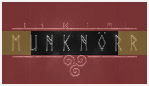
The image is cut differently depending on the viewer’s device (TV, PC, Tablet or Mobile). Creating the perfect banner is tricky, but the problem was cleverly solved subtlety adjusting some elements of the logo to the platform’s grid.
